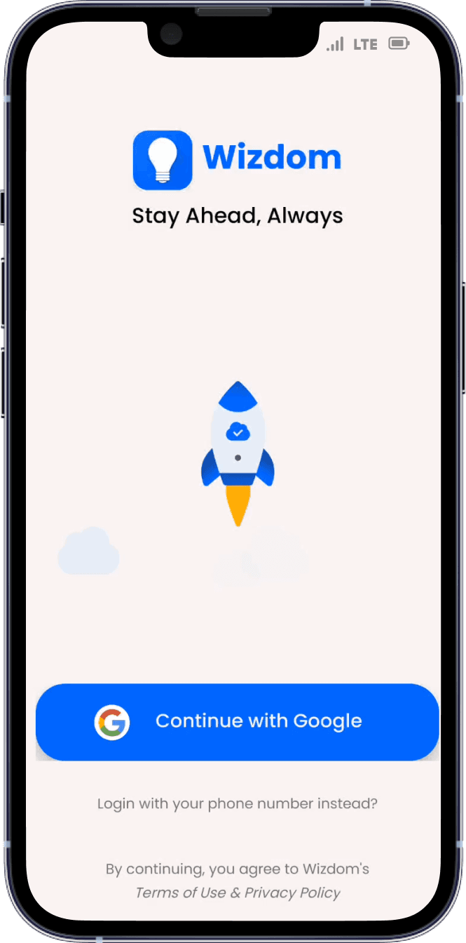
Wizdom
Case Study For Enhancing User Experience


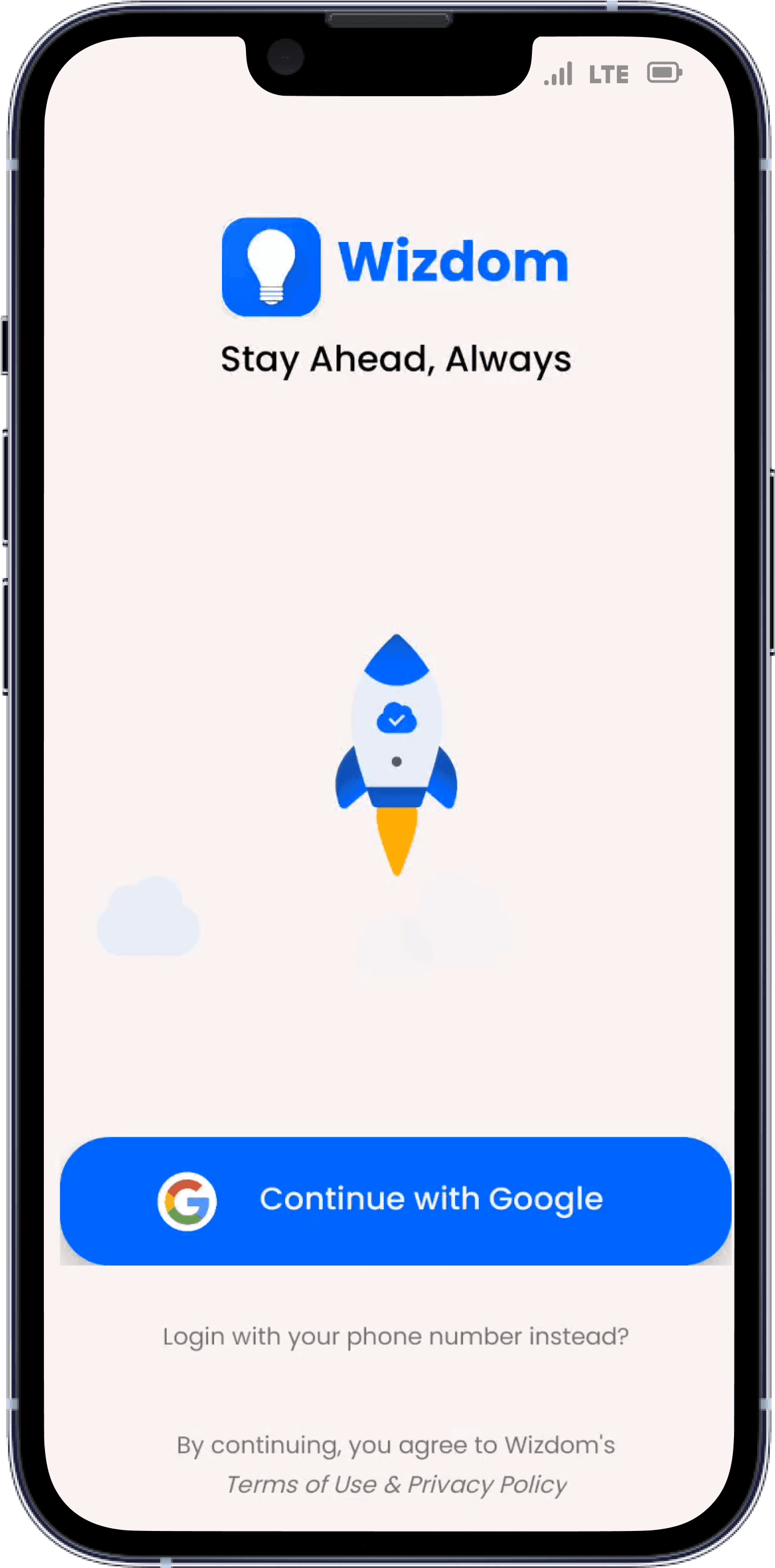
As the hours passed by, the day grew increasingly challenging, with every task feeling like a hurdle to overcome and every moment seeming to drag on endlessly...
I decided to delve into the world of storytelling by either reading a book or immersing myself in a podcast and relax...But-

-i am unable to visit the library for reading due to work commitments at the office...so


-i am unable to visit the library for reading due to work commitments at the office...so
umm...let's try this!

Ok...Good reviews


Aaahh...Great start!

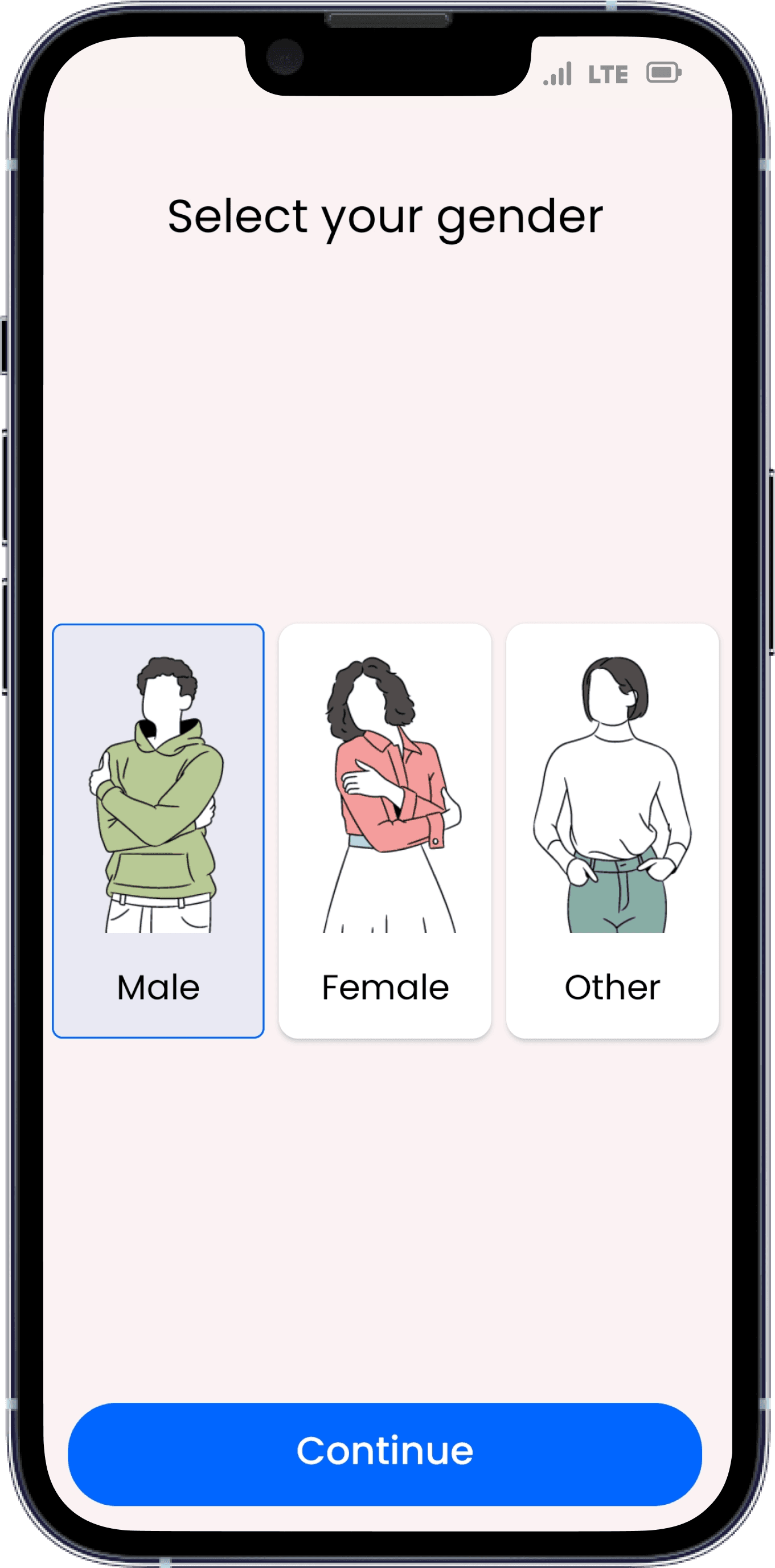
Things got serious quickly though...let's continue!

Hmm...They're trying to make it interesting ...let's just click on the male and continue
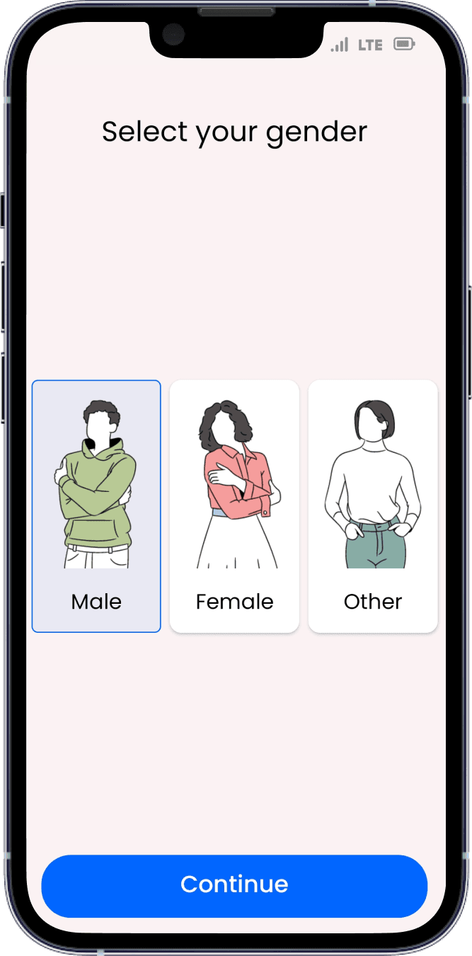
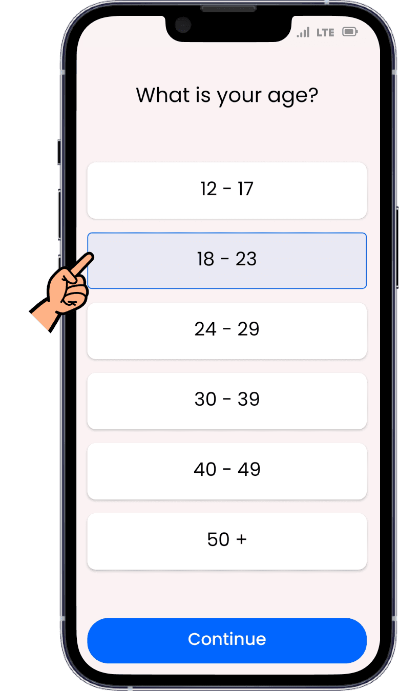
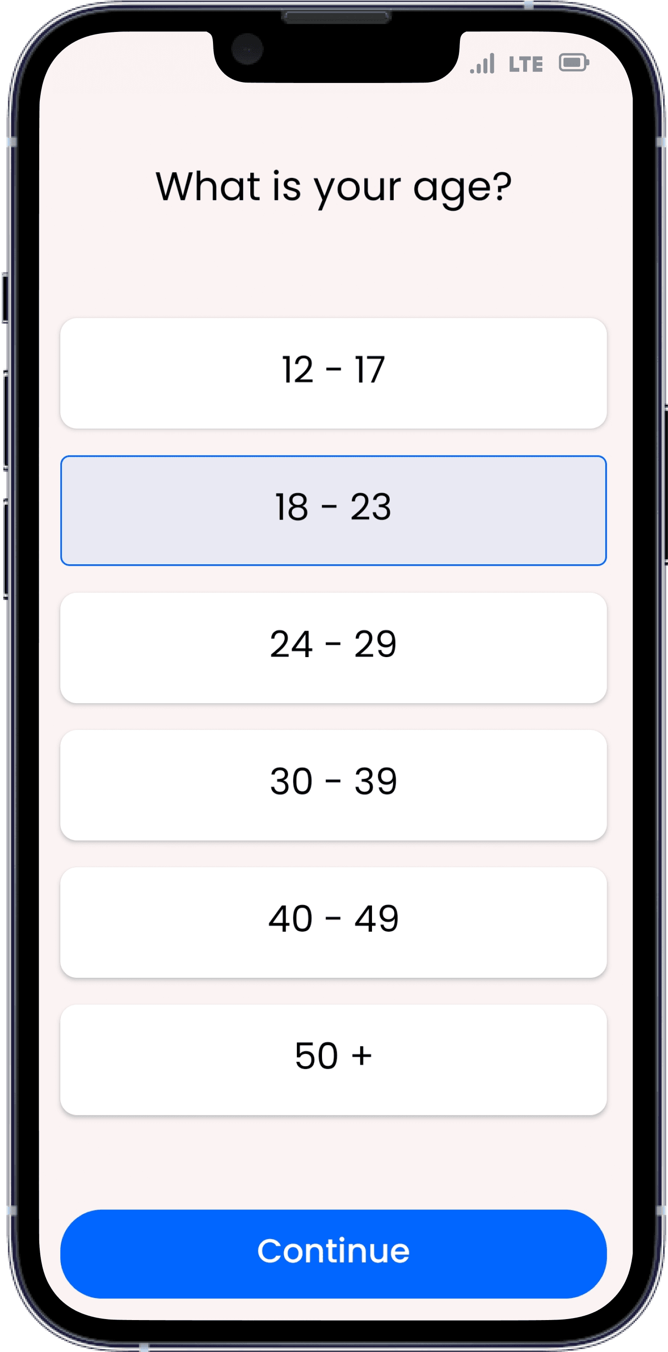
What?? I'm just 20
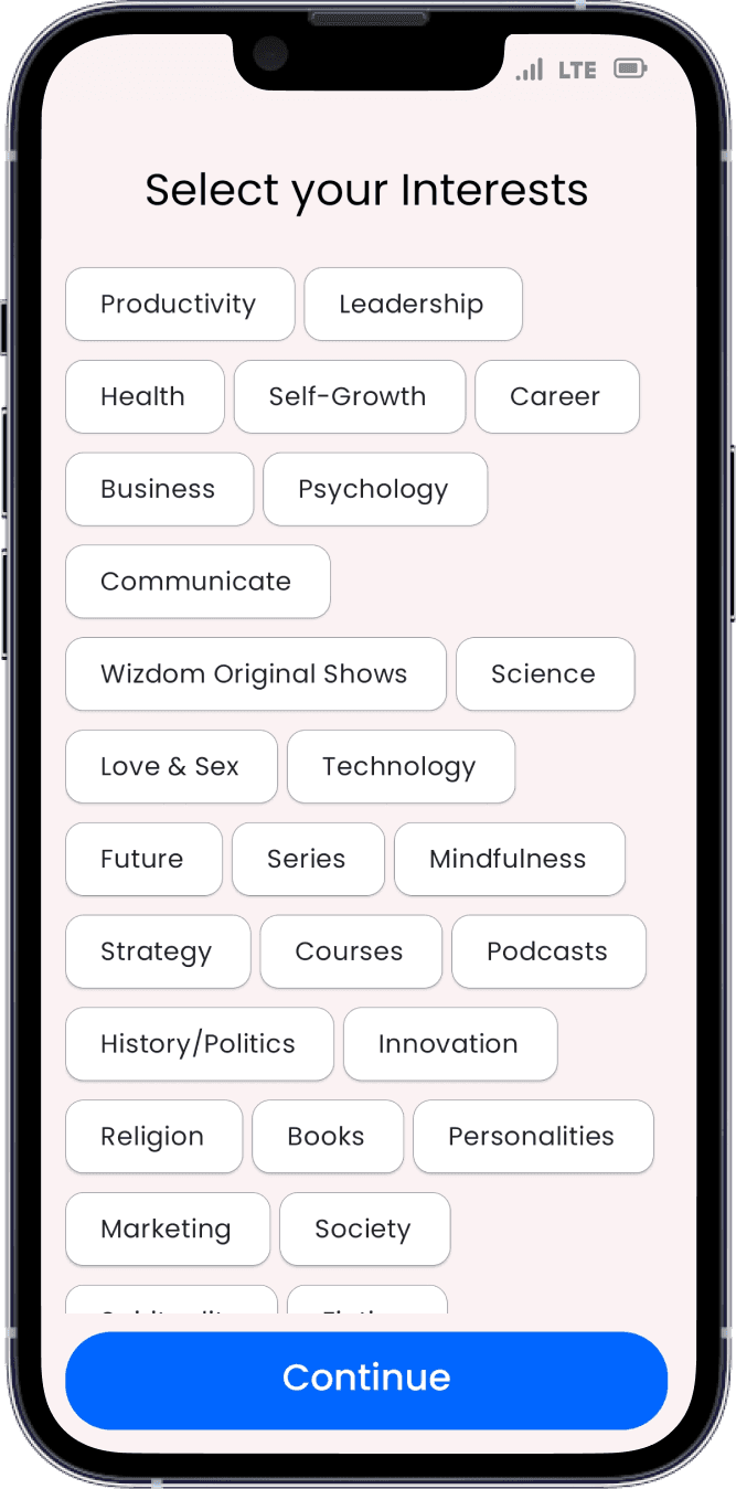
Interesting...so many options to choose for my interest!


.....

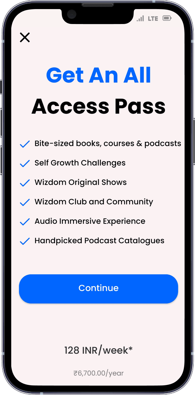
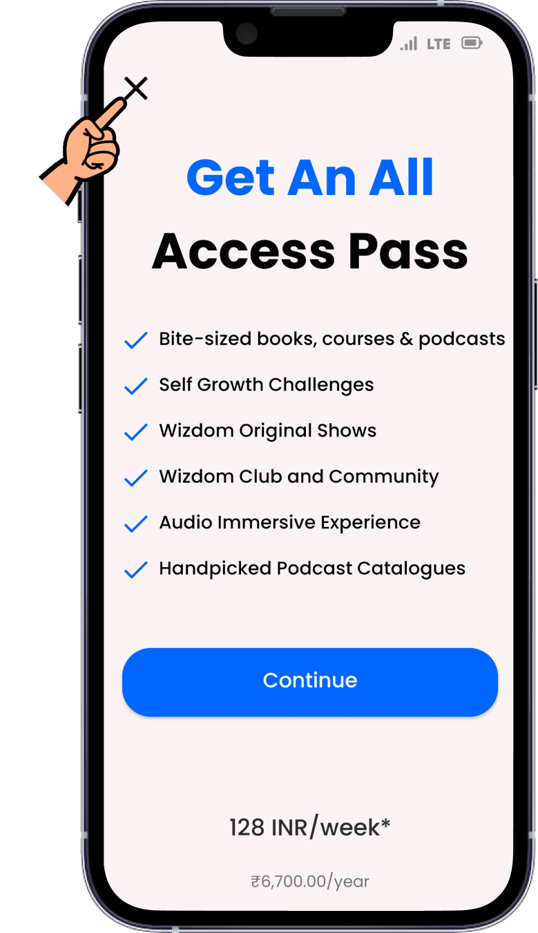
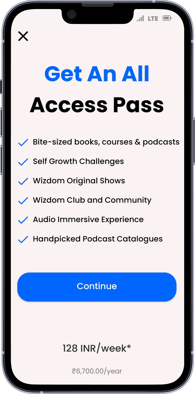
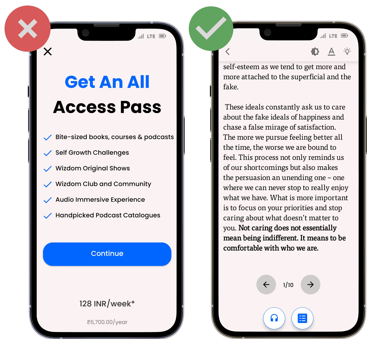
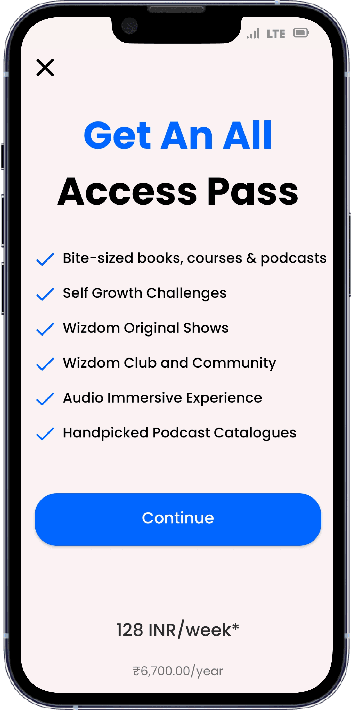
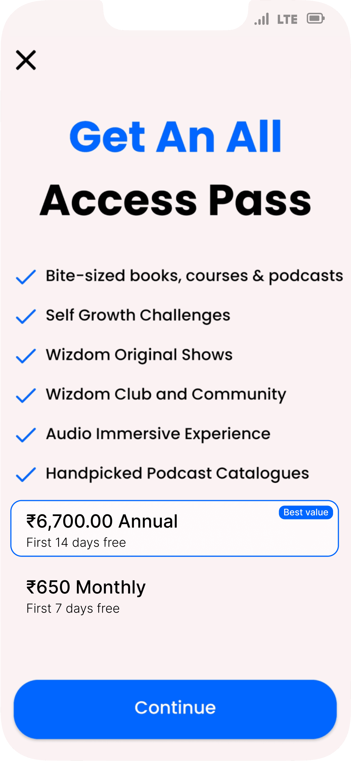
Argh...A paywall before I even see the app!

So...am I supposed to pay just to explore the app?
Asking users to subscribe too early in the user journey may result in a bad user experience, this may discourage the user to explore the app further. Users may not fully understand the value proposition of the app, and thus may be reluctant to commit to a subscription without fully exploring it first.
Therefore, it's generally recommended to provide users with a free trial or a freemium model, allowing them to experience the app before asking them to subscribe. This approach can help users build trust in the app and better understand its value
#PHYCHOLOGY INSIGHT

Yesss....now I can explore it completely at least for 7 days without any cost


The difference is subtle but has huge impact..

We're in!
...but...
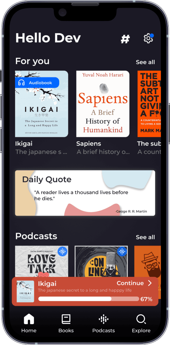
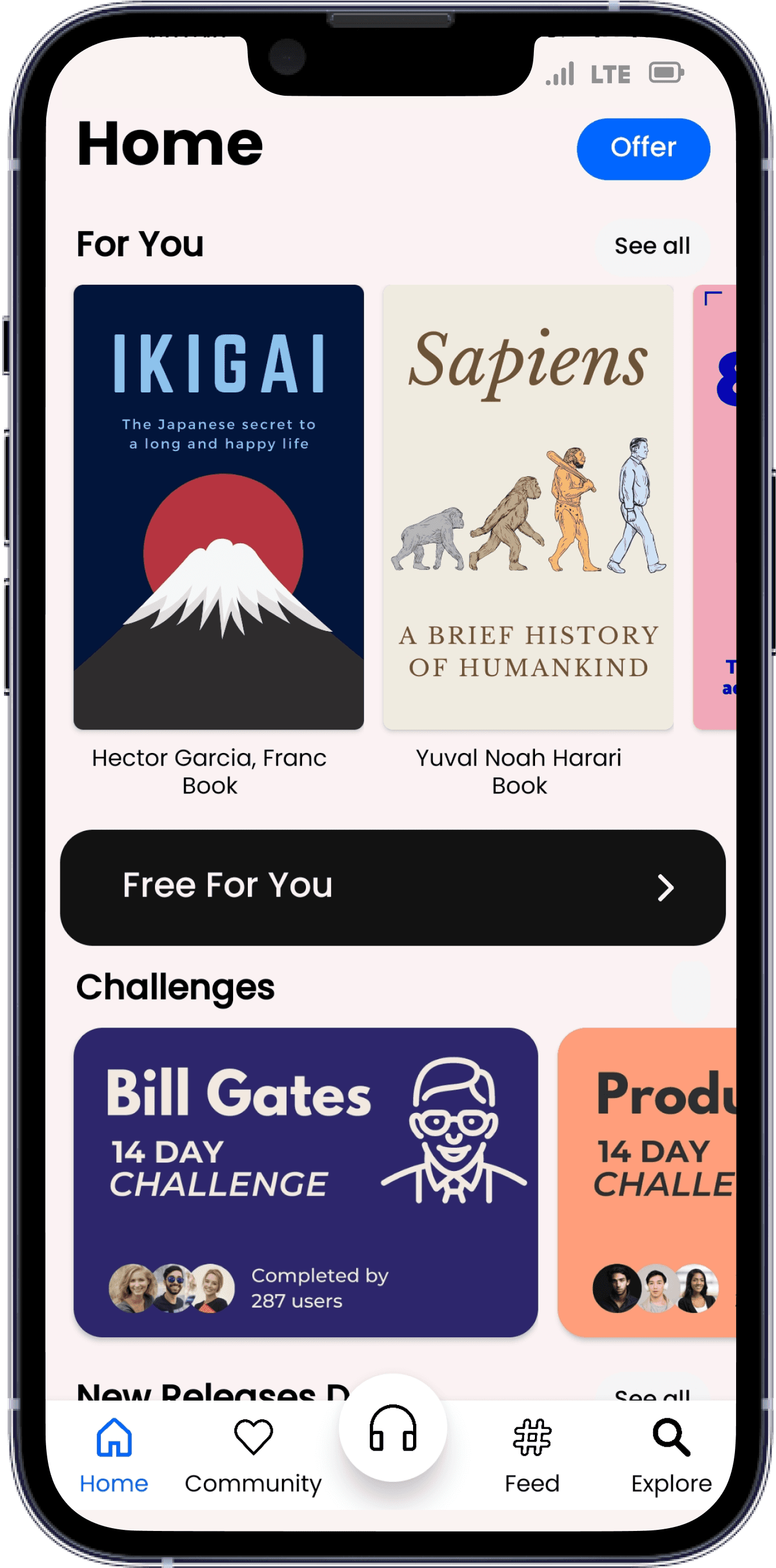
"Free For You"?
Not sure what it is let's check it
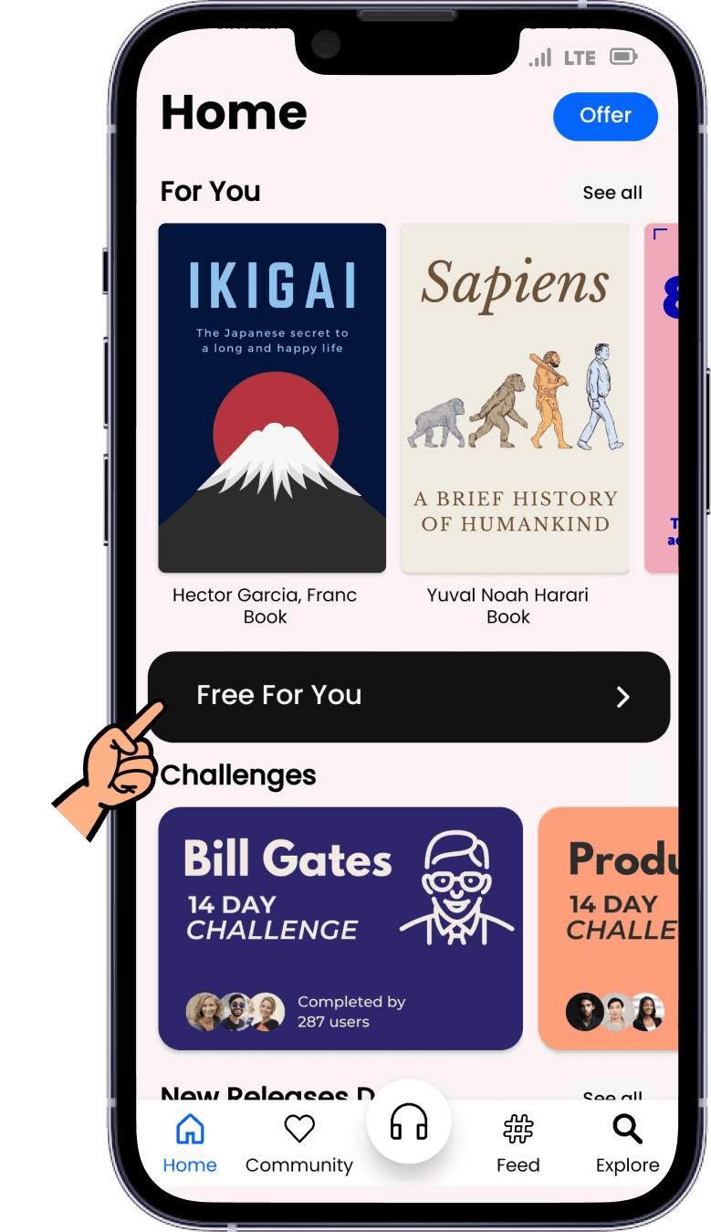

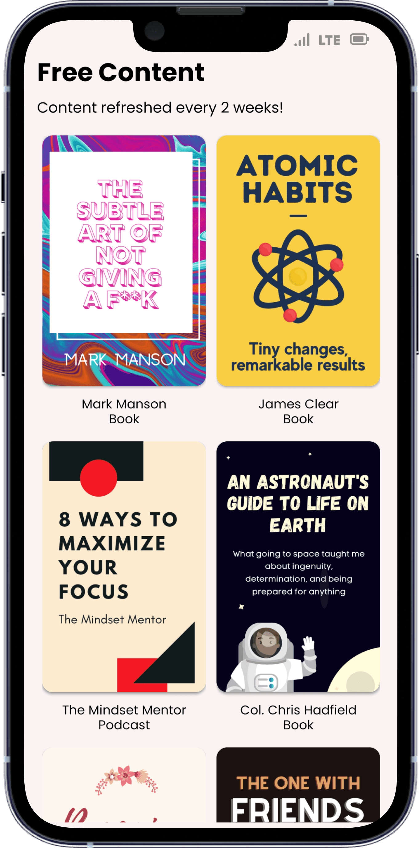
Hmm...nice!
These are completely free + refreshes every 2 weeks

But what would happen if I just clicked on another card instead of this section?
Umm... let's see
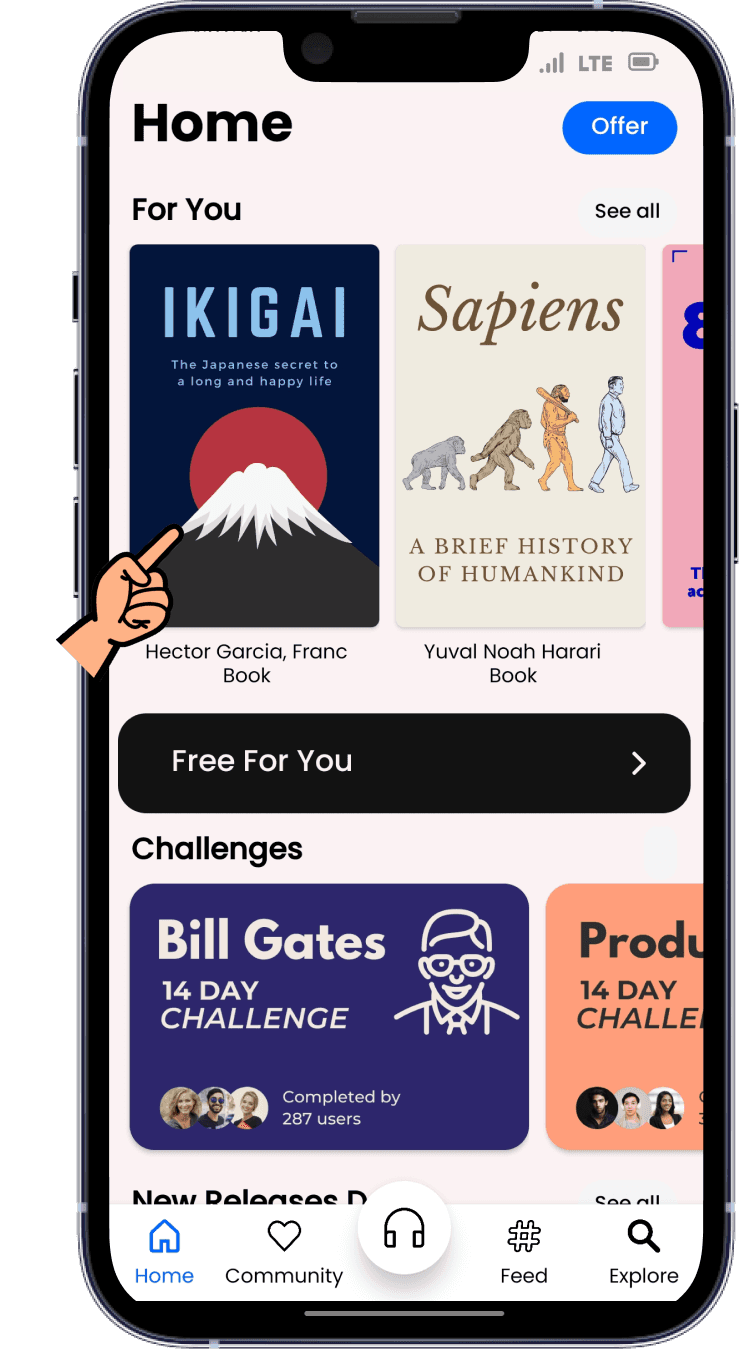

"Tap"
"Read"

"Tap"
"Read"
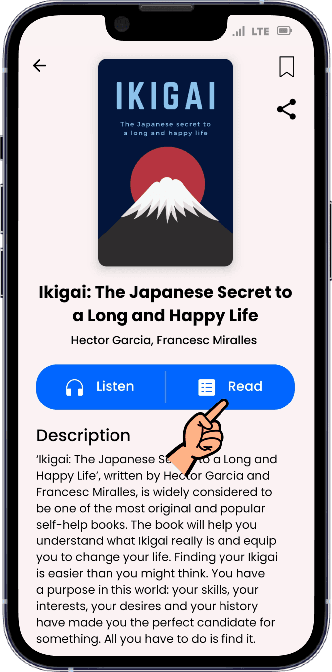
Hmm...better ig
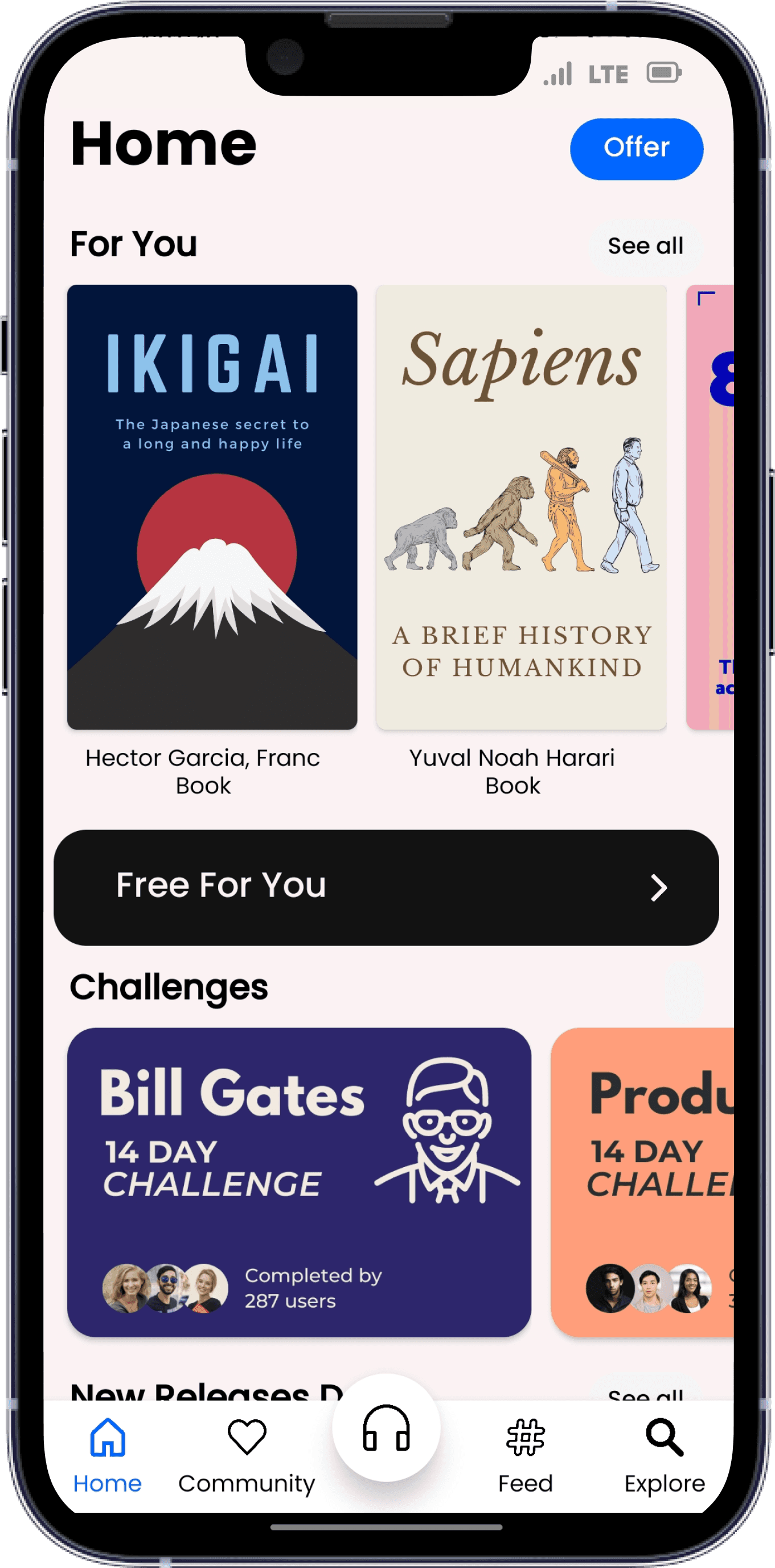
Now before plans screen this first page of book would open
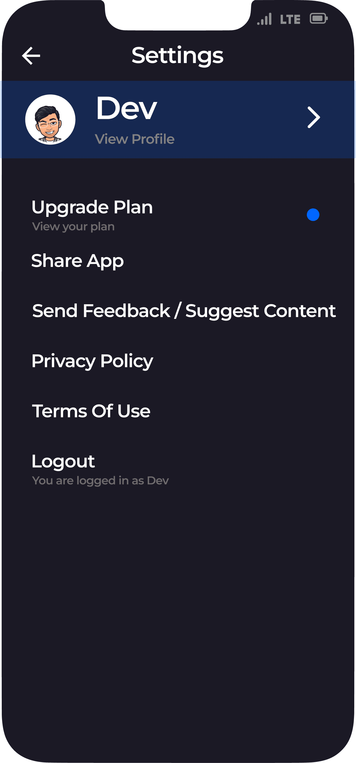
Let's redesign the home page

Hehehe
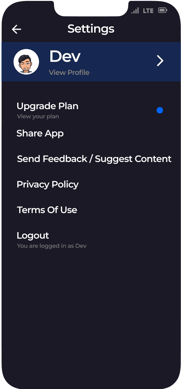
Added notification icon and settings
Now no need to add offer button

And yes we're done with this case study
Wizdom
Case Study For Enhancing User Experience
As the hours passed by, the day grew increasingly challenging, with every task feeling like a hurdle to overcome and every moment seeming to drag on endlessly...
I decided to delve into the world of storytelling by either reading a book or immersing myself in a podcast and relax...But-
-i am unable to visit the library for reading due to work commitments at the office...so
-i am unable to visit the library for reading due to work commitments at the office...so
umm...let's try this!
Ok...Good reviews
Aaahh...Great start!
Things got serious quickly though...let's continue!
Hmm...They're trying to make it interesting ...let's just click on the male and continue
What?? I'm just 20
Interesting...so many options to choose for my interest!
.....
Argh...A paywall before I even see the app!
So...am I supposed to pay just to explore the app?
Asking users to subscribe too early in the user journey may result in a bad user experience, this may discourage the user to explore the app further. Users may not fully understand the value proposition of the app, and thus may be reluctant to commit to a subscription without fully exploring it first.
Therefore, it's generally recommended to provide users with a free trial or a freemium model, allowing them to experience the app before asking them to subscribe. This approach can help users build trust in the app and better understand its value
#PHYCHOLOGY INSIGHT
Yesss....now I can explore it completely at least for 7 days without any cost
The difference is subtle but has huge impact..
We're in!
...but...
"Free For You"?
Not sure what it is let's check it
Hmm...nice!
These are completely free + refreshes every 2 weeks
But what would happen if I just clicked on another card instead of this section?
Umm... let's see
"Tap"
"Read"
"Tap"
"Read"
Hmm...better ig
Now before plans screen this first page of book would open
Let's redesign the home page
Hehehe
Added notification icon and settings
Now no need to add offer button
And yes we're done with this case study
Wizdom
Case Study For Enhancing User Experience

As the hours passed by, the day grew increasingly challenging, with every task feeling like a hurdle to overcome and every moment seeming to drag on endlessly...

I decided to delve into the world of storytelling by either reading a book or immersing myself in a podcast and relax...But-

-i am unable to visit the library for reading due to work commitments at the office...so
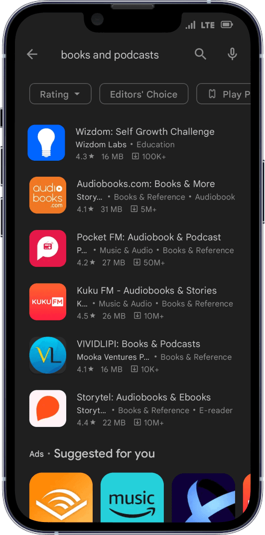
open my play store and start searching for the app


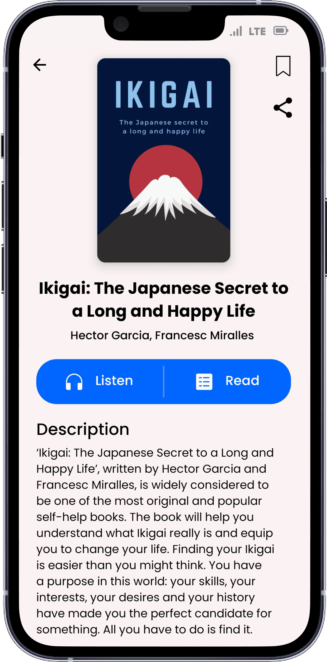
umm...let's try this!

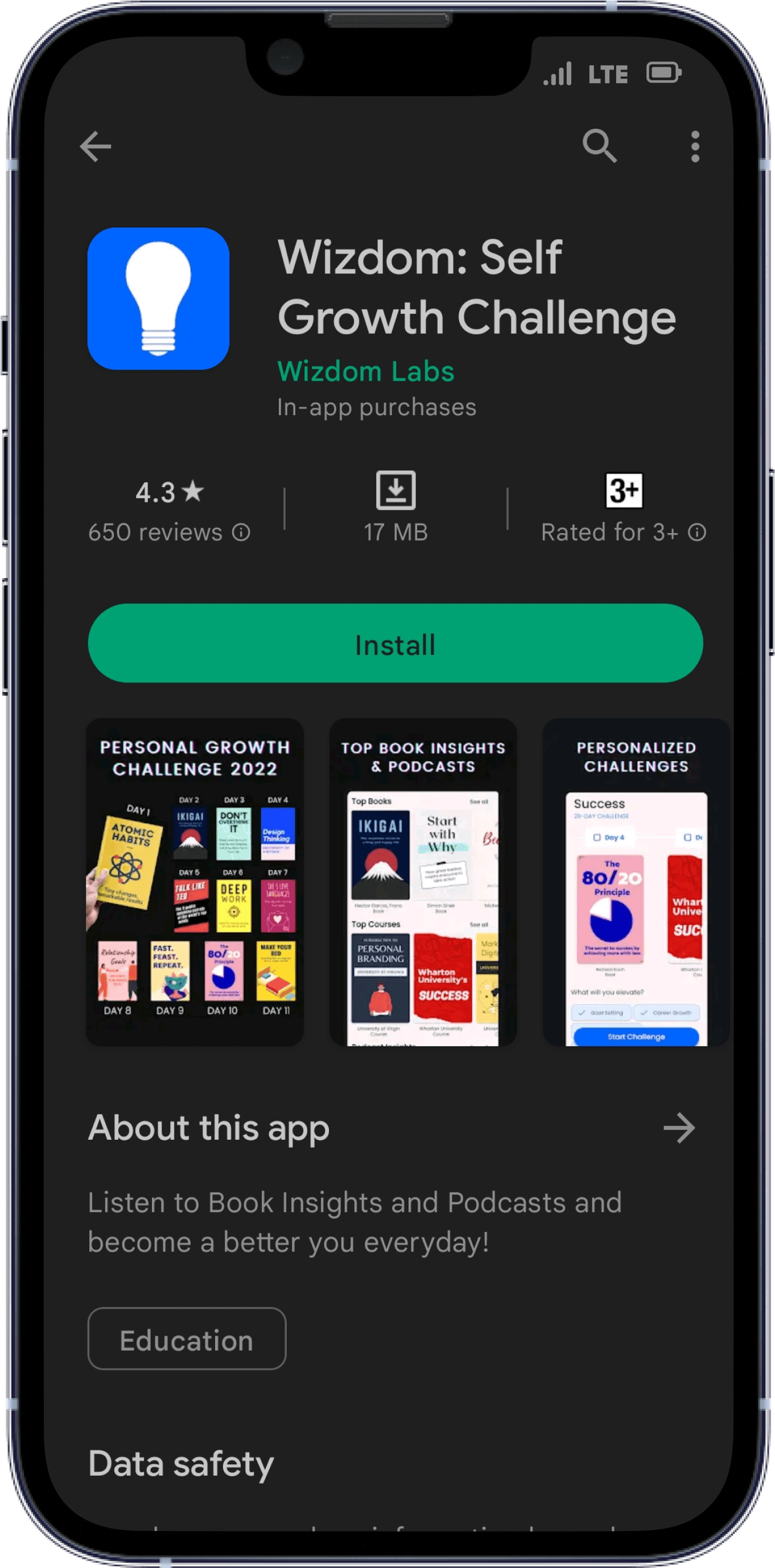

Ok...Good reviews
Aaahh...Great start!
Things got serious
quickly though...
let's continue!
Hmm...They're trying to
make it interesting ...
let's just click on the
male and continue
What?? I'm just 20
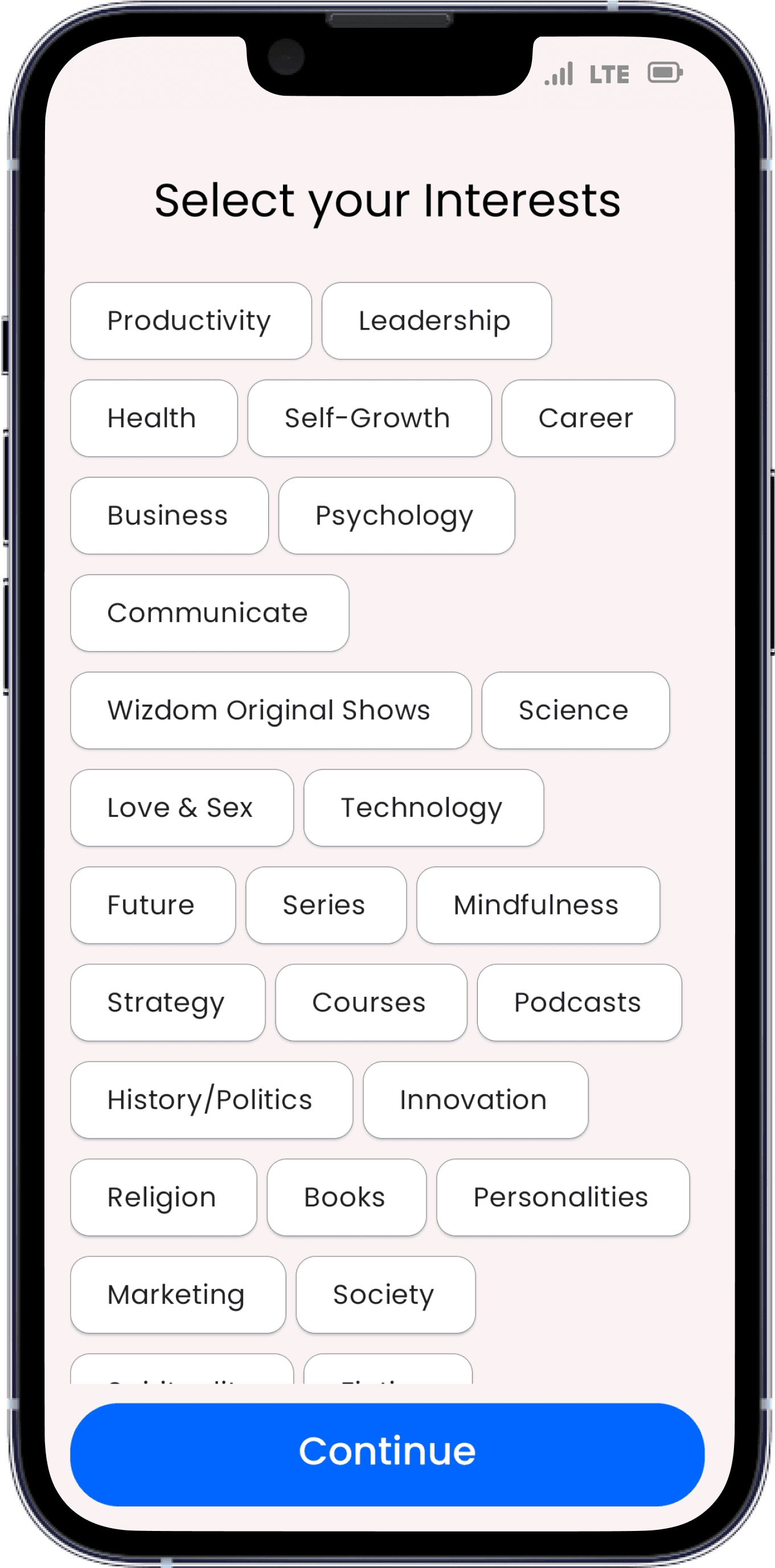
Interesting...so
many options to
choose for my interest!

......
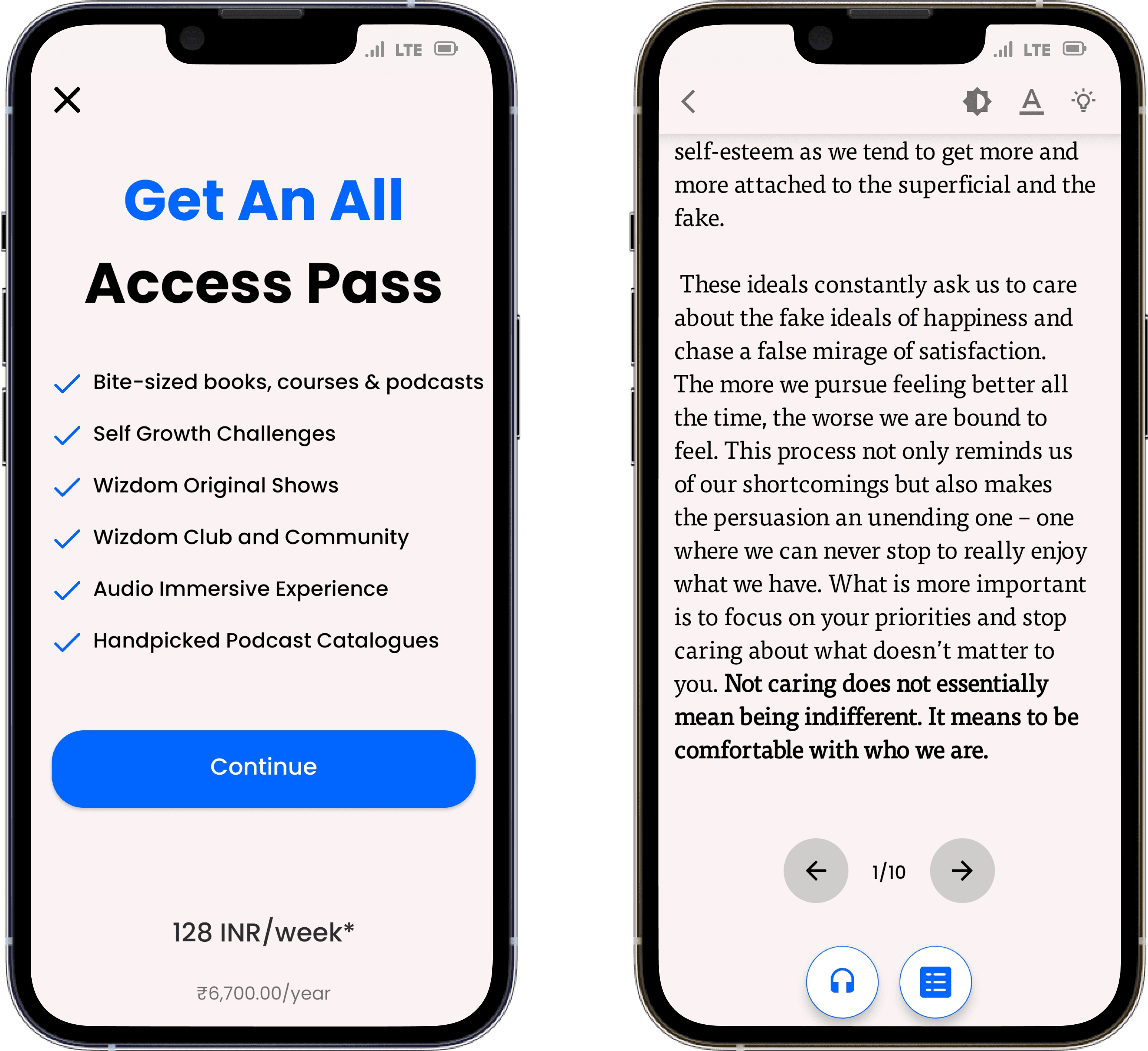
Argh...A paywall before I even see the app!
So...am I supposed to pay just to explore the app?
Asking users to subscribe too early in the user journey may result in a bad user experience, this may discourage the user to explore the app further. Users may not fully understand the value proposition of the app, and thus may be reluctant to commit to a subscription without fully exploring it first.
Therefore, it's generally recommended to provide users with a free trial or a freemium model, allowing them to experience the app before asking them to subscribe. This approach can help users build trust in the app and better understand its value
#PHYCHOLOGY INSIGHT
Yesss....now I can explore it completely at least for 7 days without any cost
The difference is subtle but has huge impact…anyways
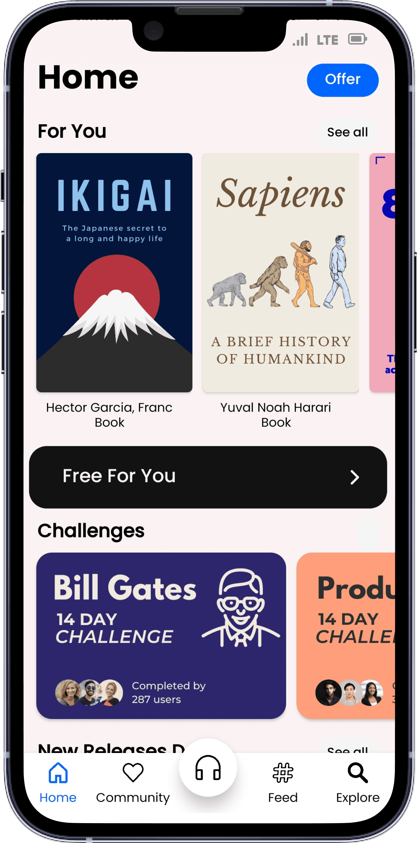
We're in! ...but... "Free For You"? Not sure what it is let's check it
Hmm...nice! These are completely free + refreshes every 2 weeks
But what would happen if I just clicked on another card instead of this section?
Umm... let's see
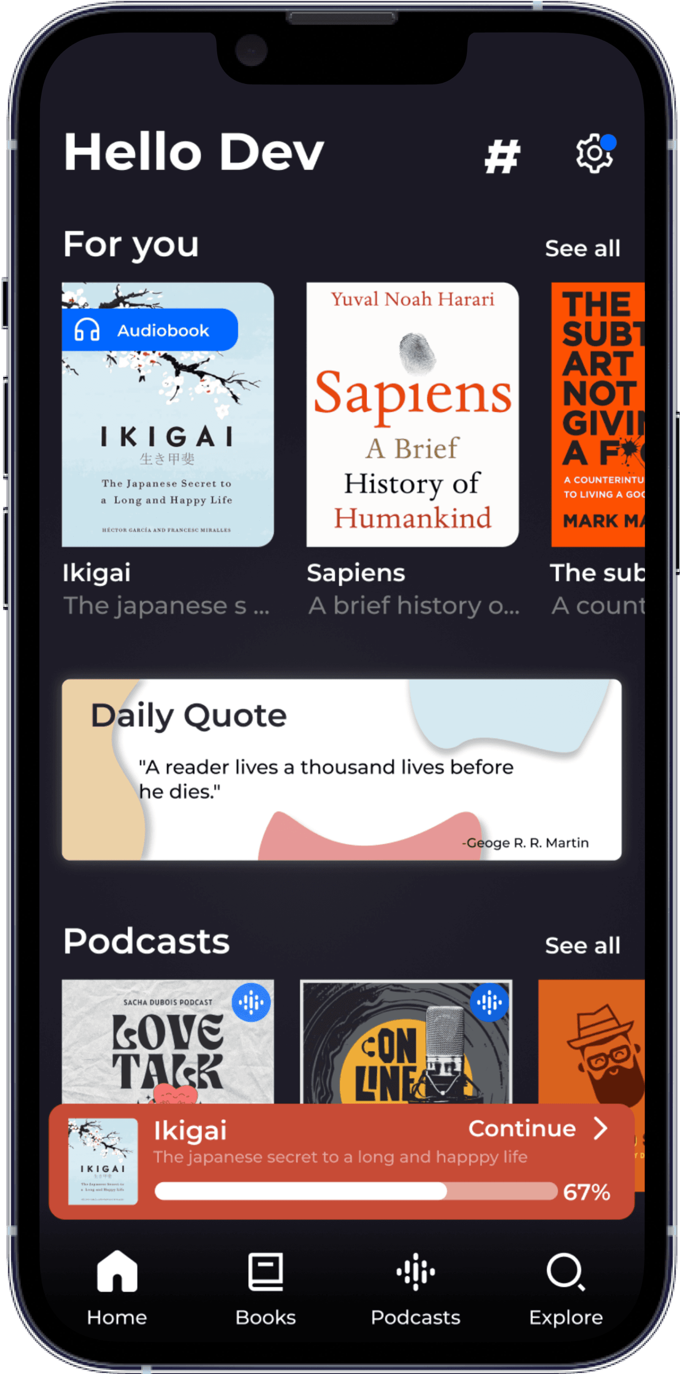
"Tap" "Read"

!!!
Hmm...better ig Now before plans screen this first page of book would open
Let's redesign the home page
Hehehe Added notification icon and settings
Now no need to add offer button
And yes we're done with this case study
Wizdom
Case Study For Enhancing User Experience
As the hours passed by, the day grew increasingly challenging, with every task feeling like a hurdle to overcome and every moment seeming to drag on endlessly...
I decided to delve into the world of storytelling by either reading a book or immersing myself in a podcast and relax...But-
-i am unable to visit the library for reading due to work commitments at the office...so
open my play store and start searching for the app
umm...let's try this!
Ok...Good reviews
Aaahh...Great start!
Things got serious
quickly though...
let's continue!
Hmm...They're trying to
make it interesting ...
let's just click on the
male and continue
What?? I'm just 20
Interesting...so
many options to
choose for my interest!
......
Argh...A paywall before I even see the app!
So...am I supposed to pay just to explore the app?
Asking users to subscribe too early in the user journey may result in a bad user experience, this may discourage the user to explore the app further. Users may not fully understand the value proposition of the app, and thus may be reluctant to commit to a subscription without fully exploring it first.
Therefore, it's generally recommended to provide users with a free trial or a freemium model, allowing them to experience the app before asking them to subscribe. This approach can help users build trust in the app and better understand its value
#PHYCHOLOGY INSIGHT
Yesss....now I can explore it completely at least for 7 days without any cost
The difference is subtle but has huge impact…anyways
We're in! ...but... "Free For You"? Not sure what it is let's check it
Hmm...nice! These are completely free + refreshes every 2 weeks
But what would happen if I just clicked on another card instead of this section?
Umm... let's see
"Tap" "Read"
!!!
Hmm...better ig Now before plans screen this first page of book would open
Let's redesign the home page
Hehehe Added notification icon and settings
Now no need to add offer button
And yes we're done with this case study