


team
Arjun - UX researcher, Harshil - UX researcher, Praveen - PM, Thomas - Full stack.
Timeline
June 2023 - August 2023
Overview
MAIN PROBLEM
Last month, I had the chance to attend CSS Day in Amsterdam, a two day event split between a “UI day” focusing on the intersection of design and development and a “CSS day”, with speakers who covered more in-depth, technical CSS subjects. The talks were as diverse as the background of the speakers themselves, but there was one common thread: In this era of rapid change, are we, as product people, equipped to design for automation, machine learning, and AI?
What does automation mean for designers?
It's hard to work on a product team that hasn’t automated some part of their workflow in the name of productivity. If machines can take care of the repeatable tasks and heavy lifting, designers can focus on doing more meaningful work. But how does this affect the way we use the work being created by machines?
Josh Clark, founder of design studio Big Medium, provoked the audience with this very question during his talk, ‘A.I. is your New Design Material’. Some of the most impressive advancements in recent technology are things like facial recognition, predictive text, and image search, all powered by machine learning. But it's important to remember—all of these technologies are still built on code. The upside is less room for error. No real emotions, expectations, or feelings get in the way of the job it was designed to do.
Yet, as humans, we assume that when facial recognition fails, the whole process is inherently flawed. But was it really?
According to Josh, that is the most fundamental thing to understand when it comes to machines. Not meeting our human expectations, doesn’t automatically make the technology itself a failure. These things were, by definition, built on logic, which begs the question: Can a robot's solution actually be wrong?
The point of introducing machine learning into our products was never to have them do all the work. Instead, algorithms and logic-based solutions ought only provide humans with better insight so as to empower us to arrive at better solutions, faster.
This fundamental understanding our users that really helps us make better products. This might be a simple example, but if a computer can figure out how to walk on it's own, maybe it's time to start investigating why and how these solutions were formed.
How do we design for the unknown future?
Jared Spool, Co-Founder of UIE asks, “What was the most important thing you learned yesterday, and how will it impact what you do in the future?”
As designers and researchers, we essentially always need to think about how we design products for the future, even as we’re meeting the demands of present day design. A tall order, especially when things move as fast as they have been over the last decade.
To start, Jared advocates for looking back at the ways in which our design processes have already changed.
Remember when UX/UI wasn't a priority for many companies? As a consultant during a time when the Internet had yet to hit mass market appeal, Jared was able to steer many companies into a mindset that considered the user experience of a product.
But this also lets us gain input into how UX and UI has looked over the years, which might give us a better idea of what these concepts will look like moving forward. Jared describes a term called "The UX Tipping Point", with great actionable steps on how to get there.
In the past, designers had to fight for a seat at the table. If today you’re not starting from a place of advocating for user experience (like they were 10 years ago), they’re likely not starting at that tipping point. As a result, designers still have to ensure that the role of UX matures within the company, as well as the understanding of what makes UX important. When an organization hits the last stage, and fully embraces UX design from everything the company does, they fully hit The UX Tipping Point.
Are we designing for users or ourselves?
People don't always know what they want, even if they think the do. As Joe Leech, a UX psychologist says, "People want more choices, but can't deal with them.”
So how do we design for our users, if our users aren’t always telling us the truth? This is one of the most important questions, and something that extensive UX research helps us accomplish.
Back in the 2000s, psychologists Sheena Iyengar and Mark Lepper ran a study regarding consumer choices. They went to a local supermarket, and instructed the store to only sell 6 varieties of jam one week, followed by 30 varieties the following week.
They ran a study on how much jam was sold, and to everyone's surprise, more jam was sold on the week with only 6 choices. But interestingly enough, when the consumers were asked which week they preferred more, they responded with the week that had 30 choices.
Using this analogy, Joe makes a point that is hard to argue with, “A designer who doesn't understand psychology is going to be more successful than an architect who doesn't understand physics".
User research, and a wide variety of it, helps teams get as close as possible to the root of a user’s needs, over their wants. Studying responses on a larger scale is more work, but it helps form the foundation for true UX.
what they faced
To gain deeper insights, I thoroughly analyzed the data provided by the UX researchers and product managers. This revealed key pain points in the user experience:
Dish Selection :
Users often felt overwhelmed when trying to explore and decide what to eat, leading to confusion during the selection process.
Preparing the Tray :
Many struggled with placing the correct ingredients in the right portions, making this step unnecessarily complex.
Challenging UI :
The interface elements were too small and unclear, causing users difficulty in understanding and making decisions as they progressed.
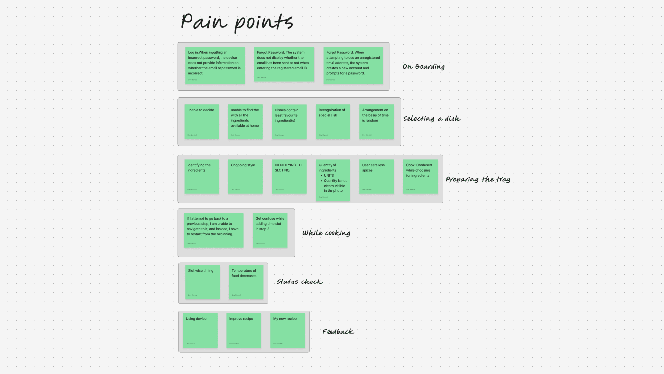
Pain Points
IMG
How user were affected
When we set out to design this AI-powered cooking robot, the goal was to simplify meal preparation for users. However, as we observed real interactions, it became clear that certain usability challenges were making the experience more confusing than convenient. To create a truly seamless journey, we needed to address these key gaps:
Lack of Guidance & Preview (Jakob’s Law & Mental Models)
Imagine using a completely new device without any instructions—frustrating, right? Many users found it difficult to understand how the cooking robot worked because there was no clear preview or onboarding process. Without proper guidance, they struggled to trust the system and complete their tasks with confidence.
Cognitive Load Due to Missing Visual Cues (Gestalt Principles & Fitts' Law)
Users expect intuitive visual elements like icons and images to guide their actions. However, the lack of these cues forced them to rely on trial and error, increasing mental effort and slowing down decision-making. This unnecessary cognitive load made the cooking process feel more complicated than it needed to be.
Ineffective Focus & Hidden Elements (Hick’s Law & Visibility Principle)
Preparing the cooking tray should be a straightforward step, but hidden components and inconsistent UI patterns made it unnecessarily difficult. Users found themselves second-guessing placements, disrupting their flow and making meal preparation more time-consuming.
Aligning with the expectations
After gathering key pain points from users, I sat down with the founder to understand their expectations for both the product and the redesign process. Through multiple discussions and deep dives into Nosh’s step-by-step cooking journey, I outlined the following key objectives to enhance the overall experience:
Frictionless Meal Discovery
The process of selecting a dish should be effortless, with AI-driven suggestions tailored to user preferences, dietary needs, and past choices, making decision-making quick and intuitive.
Guided Cooking Experience
Users should feel confident throughout the cooking process with clear, step-by-step instructions, visual cues, and automated assistance that simplify complex tasks.
Real-Time Control & Flexibility
Cooking should be adaptive, allowing users to track progress, pause, adjust cooking settings, and ensure the meal stays warm until consumption.
Personalized Customization
Every user has unique taste preferences. The system should offer granular control over spice levels, consistency, and doneness, ensuring every dish meets individual expectations.
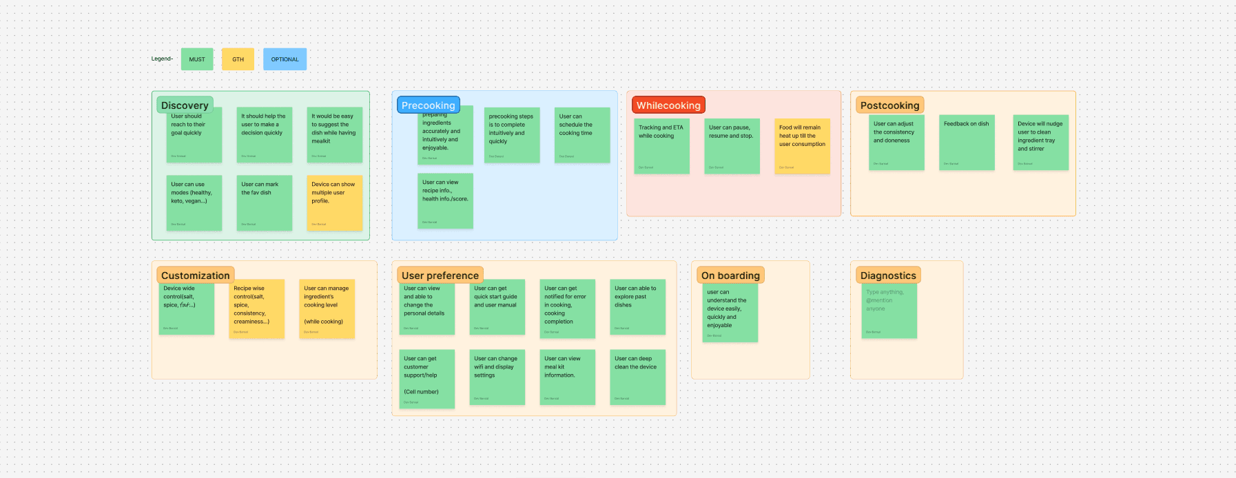
Ideations and add-on features
IMG
Flow for better flow
I took the time to thoroughly analyze the pain points, requirements, and desired features. By combining these insights, I identified key opportunities to enhance the user experience. To address these, I started mapping out how the user journey should flow. After multiple reconsideration meetings and iterations, I created a comprehensive user flow—from the very first interaction to the final step.
User Flow
FIGJAM
Wireframes
With the user flow finalized, I shifted my focus to the design phase, diving into UI exploration. While creating wireframes and gathering user feedback, I discovered another challenge—the screen’s size and its placement on the device. Positioned at the top right, it made typing and interaction difficult, adding to the usability concerns.
I shared this concern with my team, and the industrial design head explained that they had already considered this challenge while designing the future version of the device. Their updated design aimed to address these usability issues, ensuring a more seamless interaction for users.

Screen of Nosh
IMG

Wireframes
IMG
Evaluating functionality
To ensure the redesigned experience was intuitive and seamless, I conducted iterative user testing through wireframes and prototypes. Early usability tests helped identify friction points, while high-fidelity prototype feedback loops refined key interactions, ensuring smooth navigation across the cooking journey. By measuring task efficiency and error rates, I optimized flows to reduce complexity and enhance user confidence.
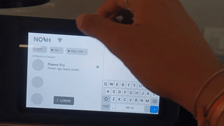
Prototype testing
GIF
Redesigning the screens
After gathering sufficient insights, I began the redesign process, starting with the first frame using the "F" layout approach.

Home screen
IMG

Discovery screen
IMG

New screens
IMG
Impact
The revamped design significantly improved user experience by enhancing clarity, efficiency, and usability. Key improvements include:
• 20% increase in user satisfaction with a more visually appealing and intuitive interface.
• 15% improvement in usability and overall effectiveness.
• 25% reduction in errors, leading to a smoother experience.
• 30% boost in task efficiency, making interactions quicker and more seamless.
Learning
Working at Nosh Robotics was a game-changer in how I approach design. Under the guidance of a senior product designer, I learned to think more critically and structure my problem-solving process. Collaborating with UX researchers was not just insightful but also fun—I got to see real user struggles and find ways to fix them.
Diving deep into the product, I faced real-time challenges that pushed me to iterate, adapt, and refine my solutions. Taking feedback, not just on my designs but on myself, helped me grow faster. This experience didn’t just make me a better designer; it shaped how I think about user experiences in a more practical and impactful way.
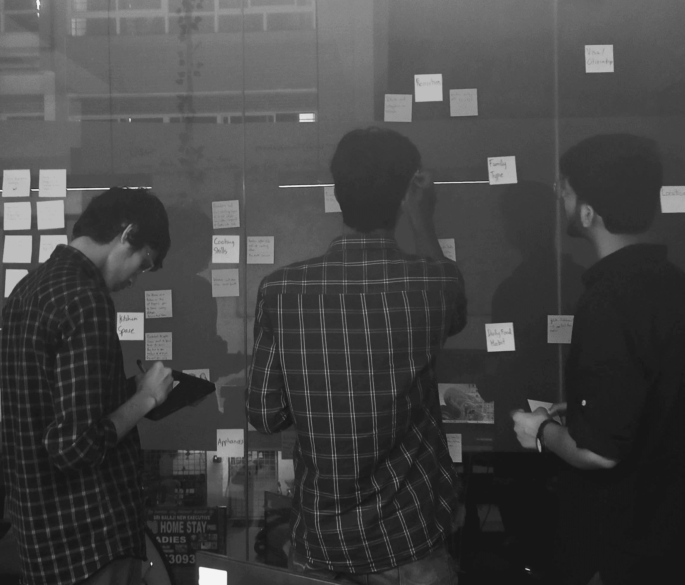
Me (Right most) with UX Researchers
IMG