


team
Arjun - UX researcher, Harshil - UX researcher, Praveen - PM, Thomas - Full stack.
Timeline
June 2023 - August 2023
Overview
MAIN PROBLEM
What is a landing page?
Whether you work in marketing, sales, or product design, you understand the importance of a quality landing page. Landing pages are standalone websites used to generate leads or sales—in other words they help you increase your revenue. Unlike typical web pages, landing pages only have one call to action, or CTA, and they are usually tied to a specific marketing or advertising campaign. The hyper-focused nature of landing pages means they come with a pretty standard set of best practices.
Landing pages vs. front pages
A typical front page or website in general includes a full navigation bar with tons of links throughout the page linking to other pages or pieces of content. A good landing page should only have one link, or multiple links that all point to the same thing. Having one CTA on your landing page increases conversions because there’s less distraction—fewer equally appealing options to prompt your users into leaving your landing page.
Your brand’s front page has totally different goals. It should show off your brand’s personality, let people explore different features, find blogs and support articles, or even apply for a job. But they won’t necessarily purchase your product from the front page. And that’s why we need landing pages.
Since landing pages are tied to specific campaigns, you don’t need to worry about users lacking information about your product. They arrived at your landing page because they were interested in an ad or post on Google, Bing, YouTube, Facebook, Instagram, Twitter, or similar places on the web. With super detailed campaigns pointing to easy-to-use landing pages, you’re getting high-quality leads that are actually interested in using your product.
Best practices for creating a landing page
What makes an easy-to-use landing page? Overall it’s clear, concise, and doesn’t give users any options except for the main CTA.In terms of copy, your landing page should have one clear message. The header of your page should promote the desired action you want visitors to take. And additionally it should explain the benefits of performing this action.
The visual design of your page should be very simple. Unlike your front page, this is not the place to go crazy with brand personality—so no wild animations or complex design elements. You wouldn’t want to distract visitors from performing the main action of your page.
Landing page CTA’s are typically buttons, sometimes accompanied by an input field if you need to collect user information. To ensure your buttons are clicked, make sure they stand out visually. This can be done with contrasting the button color with your page background and clear copy on the button itself. For example, if you are asking visitors to book a demo, write“Book a demo” clearly on the CTA button.
what they faced
To gain deeper insights, I thoroughly analyzed the data provided by the UX researchers and product managers. This revealed key pain points in the user experience:
Dish Selection :
Users often felt overwhelmed when trying to explore and decide what to eat, leading to confusion during the selection process.
Preparing the Tray :
Many struggled with placing the correct ingredients in the right portions, making this step unnecessarily complex.
Challenging UI :
The interface elements were too small and unclear, causing users difficulty in understanding and making decisions as they progressed.
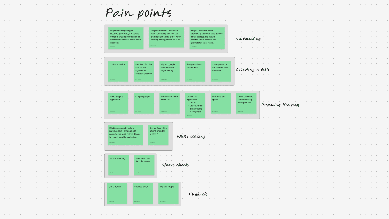
Pain Points
IMG
How user were affected
When we set out to design this AI-powered cooking robot, the goal was to simplify meal preparation for users. However, as we observed real interactions, it became clear that certain usability challenges were making the experience more confusing than convenient. To create a truly seamless journey, we needed to address these key gaps:
Lack of Guidance & Preview (Jakob’s Law & Mental Models)
Imagine using a completely new device without any instructions—frustrating, right? Many users found it difficult to understand how the cooking robot worked because there was no clear preview or onboarding process. Without proper guidance, they struggled to trust the system and complete their tasks with confidence.
Cognitive Load Due to Missing Visual Cues (Gestalt Principles & Fitts' Law)
Users expect intuitive visual elements like icons and images to guide their actions. However, the lack of these cues forced them to rely on trial and error, increasing mental effort and slowing down decision-making. This unnecessary cognitive load made the cooking process feel more complicated than it needed to be.
Ineffective Focus & Hidden Elements (Hick’s Law & Visibility Principle)
Preparing the cooking tray should be a straightforward step, but hidden components and inconsistent UI patterns made it unnecessarily difficult. Users found themselves second-guessing placements, disrupting their flow and making meal preparation more time-consuming.
Aligning with the expectations
After gathering key pain points from users, I sat down with the founder to understand their expectations for both the product and the redesign process. Through multiple discussions and deep dives into Nosh’s step-by-step cooking journey, I outlined the following key objectives to enhance the overall experience:
Frictionless Meal Discovery
The process of selecting a dish should be effortless, with AI-driven suggestions tailored to user preferences, dietary needs, and past choices, making decision-making quick and intuitive.
Guided Cooking Experience
Users should feel confident throughout the cooking process with clear, step-by-step instructions, visual cues, and automated assistance that simplify complex tasks.
Real-Time Control & Flexibility
Cooking should be adaptive, allowing users to track progress, pause, adjust cooking settings, and ensure the meal stays warm until consumption.
Personalized Customization
Every user has unique taste preferences. The system should offer granular control over spice levels, consistency, and doneness, ensuring every dish meets individual expectations.
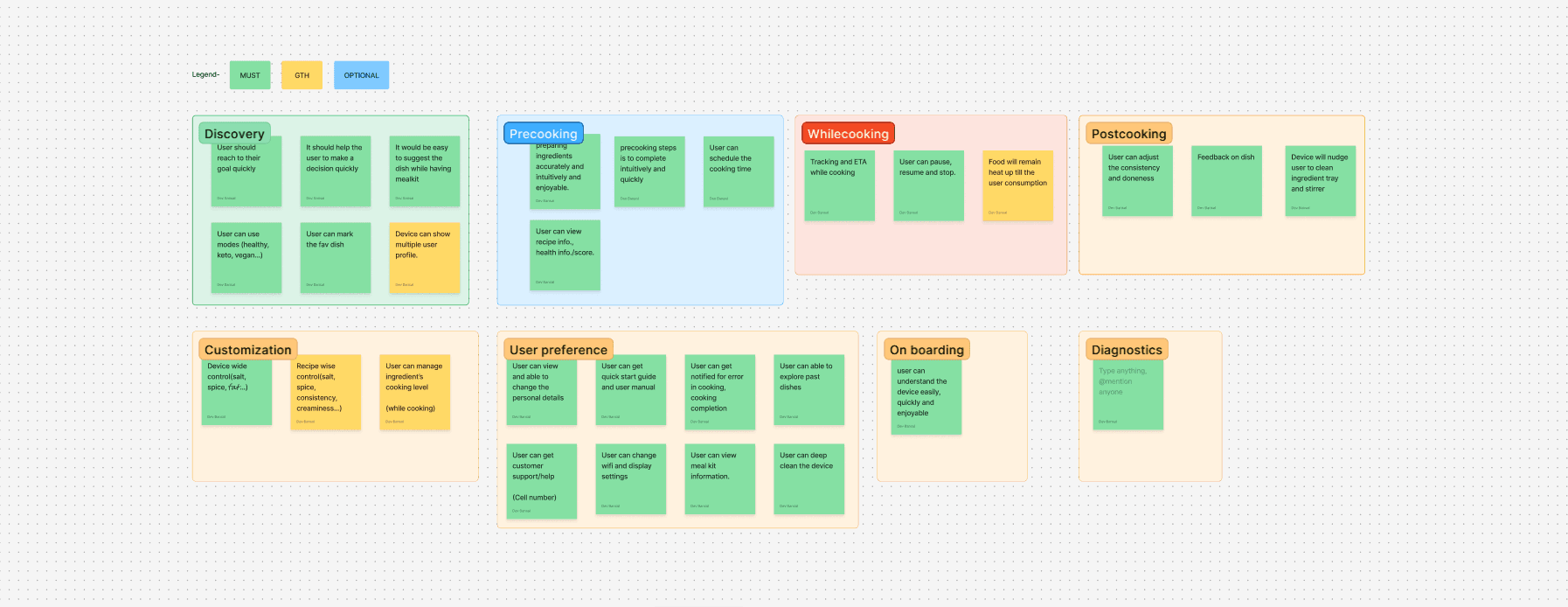
Ideations and add-on features
IMG
Flow for better flow
I took the time to thoroughly analyze the pain points, requirements, and desired features. By combining these insights, I identified key opportunities to enhance the user experience. To address these, I started mapping out how the user journey should flow. After multiple reconsideration meetings and iterations, I created a comprehensive user flow—from the very first interaction to the final step.
User Flow
FIGJAM
Wireframes
With the user flow finalized, I shifted my focus to the design phase, diving into UI exploration. While creating wireframes and gathering user feedback, I discovered another challenge—the screen’s size and its placement on the device. Positioned at the top right, it made typing and interaction difficult, adding to the usability concerns.
I shared this concern with my team, and the industrial design head explained that they had already considered this challenge while designing the future version of the device. Their updated design aimed to address these usability issues, ensuring a more seamless interaction for users.

Screen of Nosh
IMG

Wireframes
IMG
Evaluating functionality
To ensure the redesigned experience was intuitive and seamless, I conducted iterative user testing through wireframes and prototypes. Early usability tests helped identify friction points, while high-fidelity prototype feedback loops refined key interactions, ensuring smooth navigation across the cooking journey. By measuring task efficiency and error rates, I optimized flows to reduce complexity and enhance user confidence.
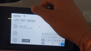
Prototype testing
GIF
Redesigning the screens
After gathering sufficient insights, I began the redesign process, starting with the first frame using the "F" layout approach.

Home screen
IMG

Discovery screen
IMG

New screens
IMG
Impact
The revamped design significantly improved user experience by enhancing clarity, efficiency, and usability. Key improvements include:
• 20% increase in user satisfaction with a more visually appealing and intuitive interface.
• 15% improvement in usability and overall effectiveness.
• 25% reduction in errors, leading to a smoother experience.
• 30% boost in task efficiency, making interactions quicker and more seamless.
Learning
Working at Nosh Robotics was a game-changer in how I approach design. Under the guidance of a senior product designer, I learned to think more critically and structure my problem-solving process. Collaborating with UX researchers was not just insightful but also fun—I got to see real user struggles and find ways to fix them.
Diving deep into the product, I faced real-time challenges that pushed me to iterate, adapt, and refine my solutions. Taking feedback, not just on my designs but on myself, helped me grow faster. This experience didn’t just make me a better designer; it shaped how I think about user experiences in a more practical and impactful way.
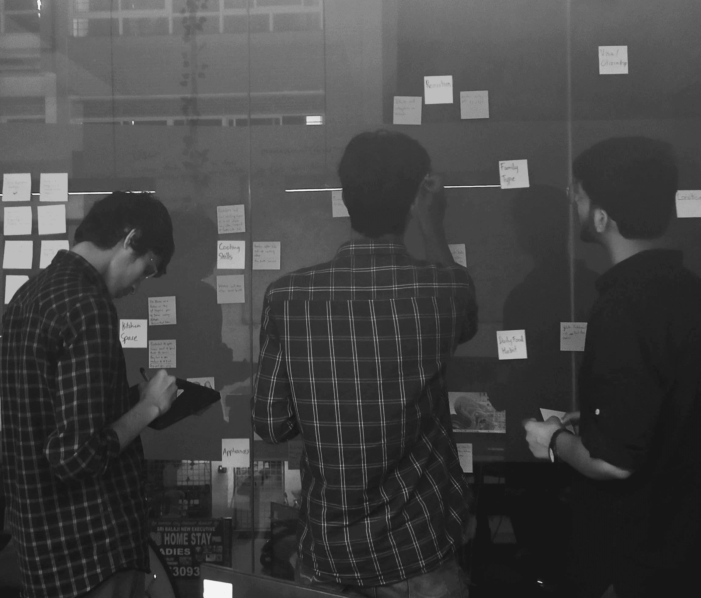
Me (Right most) with UX Researchers
IMG