




team
Arjun - UX researcher, Harshil - UX researcher, Praveen - PM, Thomas - Full stack.
Timeline
June 2023 - August 2023
Overview
MAIN PROBLEM
AltRx: Product Case Study
Company: AltRx, a US based telehealth platform offering GLP-1 and GLP-1/GIP weight loss programs
Scope: Onboarding, home screen and the product page (PDP)
About AltRx
AltRx connects patients with clinicians, prescriptions and ongoing coaching for weight loss, all through a mobile app. Before someone becomes a member, before there is any relationship with a doctor or coach, the product itself has to build the trust that would normally come from a person. That holds across onboarding, the home screen someone returns to every day, and the page where they actually decide to buy a prescription medication online.
Onboarding
The Problem
The existing onboarding worked, but it felt like a generic sign up form that happened to be collecting health data instead of a flow built for a health product.
[Image placeholder] Full old onboarding flow, cropped from Onboarding.png
A few specific issues stood out once I laid the flow out screen by screen:
The flow opened on a flat navy screen with no imagery. Nothing in the visual language signaled health or care before asking for an email.
Verification had three slightly different versions of the same screen back to back, a 4 digit OTP screen, then a 5 digit one, with the copy shifting between “Enter the OTP” and “Enter the code.” It read as unfinished rather than intentional.
Every field, name, date of birth, state, was its own full screen with a plain text input and a custom on screen number pad that duplicated the device’s own keyboard.
There was no visible sense of progress anywhere in the flow. Each “Next” felt like a blind step.
What I Was Solving For
Make the intake feel like it belongs to a health app, not a login form
Fix the inconsistency in verification so it reads as one deliberate flow
Replace manual number entry for biometric data with something more direct and tactile
Give people a way to skip questions they are not ready to answer yet
Build in a sense of progress through what is a fairly long intake
Process
I started by mapping every data point the app actually needs before a person can reach the health intake: email, OTP, name, date of birth, weight, goal weight, height, health goals and medical history. Laying these out side by side made it clear that almost all of them were being collected the same way, as plain text in a form field, regardless of what kind of data it was.
From there I went through each data point and asked whether a more direct control existed for it. A date does not need a manual text field when a wheel picker already exists on the platform. A weight or height does not need to be typed when it can be dragged. A list of medical conditions does not need to be one long checklist when it can be grouped and chosen as chips. That question shaped most of the redesign decisions that followed.
The Redesign
Rather than walk through every screen, here is why the major shifts happened.
Why the splash and verification changed
[Image placeholder] Crop of splash and verification screens from onbording_new.png
A flat navy screen with no imagery does not signal a health app before anyone has entered a single detail. The new splash uses a real photo and a one line promise instead, since a screen that looks more considered sets the expectation that the product is more considered, before a single interaction happens. Verification also had three inconsistent versions in the old flow, different digit counts, different copy, which read as unfinished rather than intentional. Making it consistent removes a small but real signal that the product was rushed.
Why biometric data moved off the keyboard
[Image placeholder] Crop of date of birth, weight, goal weight and height screens from onbording_new.png
Date of birth, weight, goal weight and height were all typed into plain text fields in the old flow, the same treatment as an email address. None of these are neutral data points in a weight loss app. Weight in particular is often the first number someone has to admit to a stranger, so it now sits behind copy like “No judgment. Just a starting point,” paired with a slider instead of a keyboard. Sliders and wheel pickers also match controls people already use elsewhere on the platform, so there is nothing new to learn, which keeps the flow moving instead of asking someone to stop and type.
Why medical history and health goals moved to chips
[Image placeholder] Crop of health goals and medical history screens from onbording_new.png
A medical questionnaire is the point in onboarding most likely to make someone feel like they are filling out paperwork. Splitting it into two themed groups instead of one long checklist, and using pill shaped chips instead of a list, breaks a heavy section into smaller decisions instead of one long one. Health goals got the same treatment, icon based cards instead of text, since scanning icons for weight loss or muscle building is a faster decision than reading through several lines. A skip option was added here too, so someone not ready to answer a medical question yet still has a way through the flow instead of being blocked by it.
Before and After
[Image placeholder] Side by side comparison of Onboarding.png and onbording_new.png
The old flow and the new one collect almost identical information. What changed is how much of that collection feels like filling out paperwork versus using a product built around a person’s body and health. Sliders, wheels and chips do not just look different from text fields, they change how much effort each step asks for.
Home Screen
The Problem
The old home screen worked as a dashboard, but it read like a subscription management screen rather than something built around a person’s weight loss journey. A gradient card showed the current plan and a progress bar, a line chart tracked weight against a goal, and a text banner suggested upgrading to a longer plan. All functional, but nothing on the screen looked like it was made for this specific product category, it could have belonged to almost any subscription app.
[Image placeholder] Crop of old home screen from Hom_new.png
Why It Changed
Why the hero moved from a gradient card to real photography
[Image placeholder] Crop of new home hero from Hero.png
The old home opened on a solid gradient card with numbers on it. The new one opens on a photograph of two people, smiling, arms around each other, paired with a specific, timely offer. A home screen someone opens every day during a weight loss program is not just a dashboard, it is a daily touchpoint, and a photo of real people does more to reinforce that this is a supportive program than another chart can.
Why the weight projection became something you drag instead of something you read
[Image placeholder] Crop of the weight loss slider card from Hero.png
The old home only showed a static line chart of weight already logged. The new home adds an interactive card, drag your current weight and see a projected loss by a certain date, directly in the feed. It turns a passive progress chart into something someone plays with, which keeps the weight loss goal active and personal every time the app is opened, not just something to check.
Why the zero state got its own design
[Image placeholder] Crop of Home-Zero_State.png
Before this, someone without weight data yet would have hit a blank or broken looking chart. The new zero state replaces that with a grayed out placeholder chart and a direct call to action, “Login to add current & goal weight.” An empty state is still a state someone will see, often on their very first visit, so it needed its own screen instead of being treated as an edge case of the populated one.
Before and After
[Image placeholder] Side by side of Hom_new.png and Hero.png
The old home screen and the new home screen show the same product becoming more specific to its category: less like subscription administration, more like a supportive daily journey.
Product Page (PDP)
This page did not exist before, so this section works differently. Instead of a before and after, it is about what the page had to do and why it ended up built the way it did.
[Image placeholder] Crop of PDP from GIP1.png
AltRx sells a prescription medication through an app, which is a different kind of purchase decision than most product pages are built for. Someone landing here is not choosing a color or a size, they are deciding whether to trust an online platform with something they would normally only get through a doctor and a pharmacy.
Why the vial got a considered product shot
The product itself is a glass vial, which does not carry much visual interest on its own. Giving it a tilted, styled photograph with its own carousel treats it like a considered object rather than a lab specimen, which matters since this photo is the first thing anyone sees on the page.
Why pricing is a list, not a single price
Four plan lengths are shown together, 3 month, 6 month, 12 month and monthly, each with its own price per month and savings called out. Listing them together, longest commitment first, lets someone compare cost against how long they are willing to commit, rather than presenting one price and hiding the tradeoff.
Why the trust bullets sit directly under pricing
Online medical consultation
Licensed clinician review
No hidden fees
No membership
These sit immediately after the pricing list, right at the point someone has just seen a number and is deciding whether to trust it. They answer the specific concerns someone has buying a prescription medication online: is a real doctor involved, and is this harder to cancel than it looks?
Why the rest of the content is behind accordions
Usage instructions, results timeline and partner pharmacy information are all necessary, but not everyone needs them before deciding to buy. Keeping them collapsed keeps the primary path on the page short, get to the price, get to the trust signals, get to the button, while still holding all the information a prescription product needs to disclose.
Closing
None of these three pieces changed what AltRx actually needs from someone. The same information gets collected, the same plans get sold, the same progress gets tracked. What changed is how much of that process feels like using a considered health product versus filling out a form or reading a spec sheet. Onboarding, home and the PDP all had to answer some version of the same question, does this feel like it was built for the moment someone is actually in.
These three are part of a much larger app I designed end to end, including the full health intake with its conditional logic, accounts, and the checkout journey. They are the flows shown here because this is where conversion actually begins, the point where someone decides to open the app, trust it enough to hand over their health information, and choose to buy. The rest of the product was built with the same thinking, but it is these three that carry the weight of turning a visitor into a member.
what they faced
To gain deeper insights, I thoroughly analyzed the data provided by the UX researchers and product managers. This revealed key pain points in the user experience:
Dish Selection :
Users often felt overwhelmed when trying to explore and decide what to eat, leading to confusion during the selection process.
Preparing the Tray :
Many struggled with placing the correct ingredients in the right portions, making this step unnecessarily complex.
Challenging UI :
The interface elements were too small and unclear, causing users difficulty in understanding and making decisions as they progressed.

How user were affected
When we set out to design this AI-powered cooking robot, the goal was to simplify meal preparation for users. However, as we observed real interactions, it became clear that certain usability challenges were making the experience more confusing than convenient. To create a truly seamless journey, we needed to address these key gaps:
Lack of Guidance & Preview (Jakob’s Law & Mental Models)
Imagine using a completely new device without any instructions—frustrating, right? Many users found it difficult to understand how the cooking robot worked because there was no clear preview or onboarding process. Without proper guidance, they struggled to trust the system and complete their tasks with confidence.
Cognitive Load Due to Missing Visual Cues (Gestalt Principles & Fitts' Law)
Users expect intuitive visual elements like icons and images to guide their actions. However, the lack of these cues forced them to rely on trial and error, increasing mental effort and slowing down decision-making. This unnecessary cognitive load made the cooking process feel more complicated than it needed to be.
Ineffective Focus & Hidden Elements (Hick’s Law & Visibility Principle)
Preparing the cooking tray should be a straightforward step, but hidden components and inconsistent UI patterns made it unnecessarily difficult. Users found themselves second-guessing placements, disrupting their flow and making meal preparation more time-consuming.
Aligning with the expectations
After gathering key pain points from users, I sat down with the founder to understand their expectations for both the product and the redesign process. Through multiple discussions and deep dives into Nosh’s step-by-step cooking journey, I outlined the following key objectives to enhance the overall experience:
Frictionless Meal Discovery
The process of selecting a dish should be effortless, with AI-driven suggestions tailored to user preferences, dietary needs, and past choices, making decision-making quick and intuitive.
Guided Cooking Experience
Users should feel confident throughout the cooking process with clear, step-by-step instructions, visual cues, and automated assistance that simplify complex tasks.
Real-Time Control & Flexibility
Cooking should be adaptive, allowing users to track progress, pause, adjust cooking settings, and ensure the meal stays warm until consumption.
Personalized Customization
Every user has unique taste preferences. The system should offer granular control over spice levels, consistency, and doneness, ensuring every dish meets individual expectations.

Flow for better flow
I took the time to thoroughly analyze the pain points, requirements, and desired features. By combining these insights, I identified key opportunities to enhance the user experience. To address these, I started mapping out how the user journey should flow. After multiple reconsideration meetings and iterations, I created a comprehensive user flow—from the very first interaction to the final step.
Wireframes
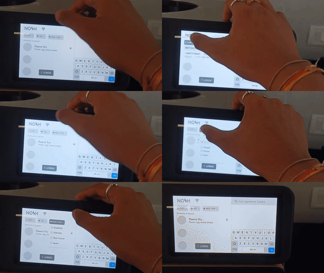
With the user flow finalized, I shifted my focus to the design phase, diving into UI exploration. While creating wireframes and gathering user feedback, I discovered another challenge—the screen’s size and its placement on the device. Positioned at the top right, it made typing and interaction difficult, adding to the usability concerns.
I shared this concern with my team, and the industrial design head explained that they had already considered this challenge while designing the future version of the device. Their updated design aimed to address these usability issues, ensuring a more seamless interaction for users.


Evaluating functionality
To ensure the redesigned experience was intuitive and seamless, I conducted iterative user testing through wireframes and prototypes. Early usability tests helped identify friction points, while high-fidelity prototype feedback loops refined key interactions, ensuring smooth navigation across the cooking journey. By measuring task efficiency and error rates, I optimized flows to reduce complexity and enhance user confidence.
Redesigning the screens
After gathering sufficient insights, I began the redesign process, starting with the first frame using the "F" layout approach.


Impact
The revamped design significantly improved user experience by enhancing clarity, efficiency, and usability. Key improvements include:
• 20% increase in user satisfaction with a more visually appealing and intuitive interface.
• 15% improvement in usability and overall effectiveness.
• 25% reduction in errors, leading to a smoother experience.
• 30% boost in task efficiency, making interactions quicker and more seamless.
Learning
Working at Nosh Robotics was a game-changer in how I approach design. Under the guidance of a senior product designer, I learned to think more critically and structure my problem-solving process. Collaborating with UX researchers was not just insightful but also fun—I got to see real user struggles and find ways to fix them.
Diving deep into the product, I faced real-time challenges that pushed me to iterate, adapt, and refine my solutions. Taking feedback, not just on my designs but on myself, helped me grow faster. This experience didn’t just make me a better designer; it shaped how I think about user experiences in a more practical and impactful way.
